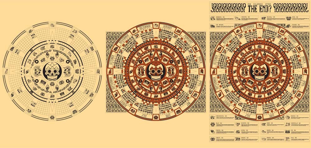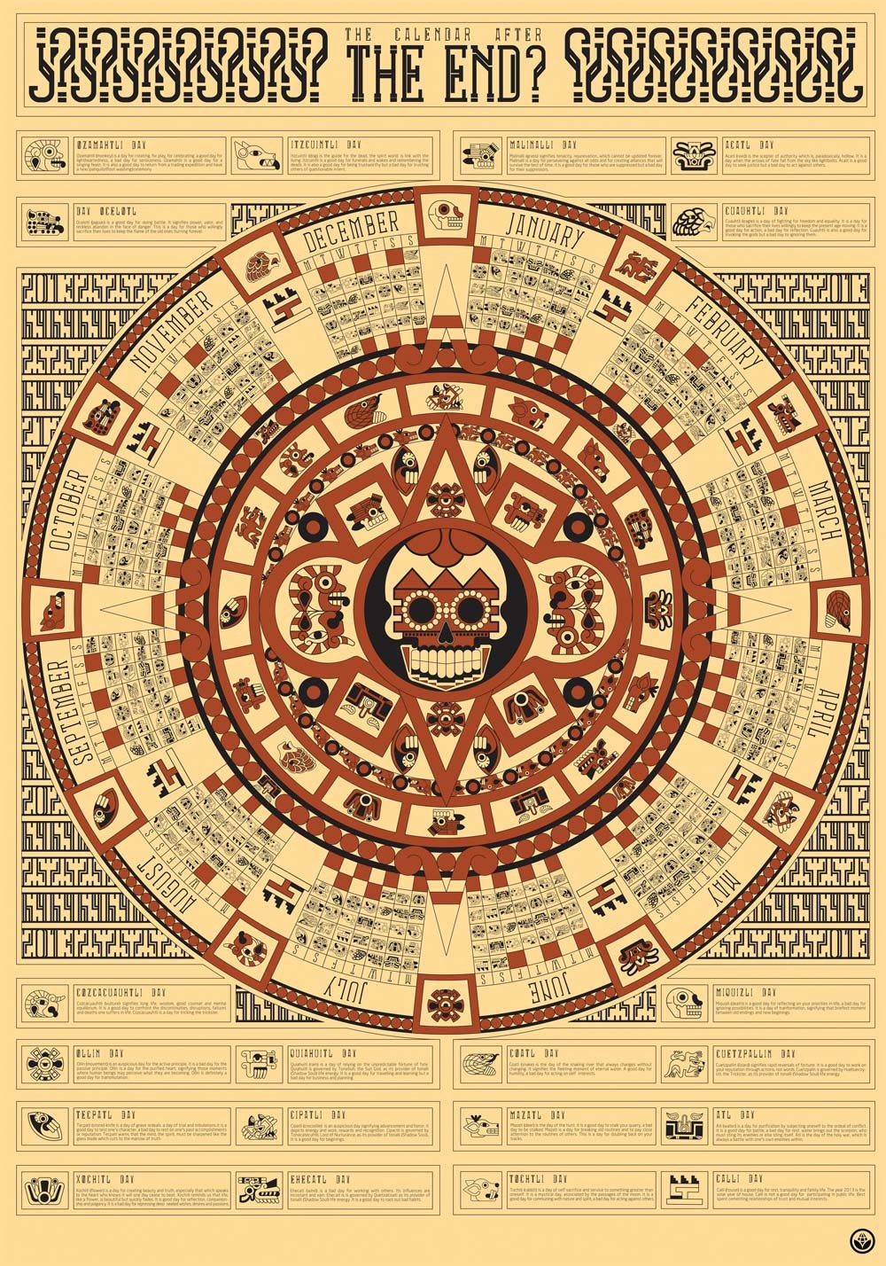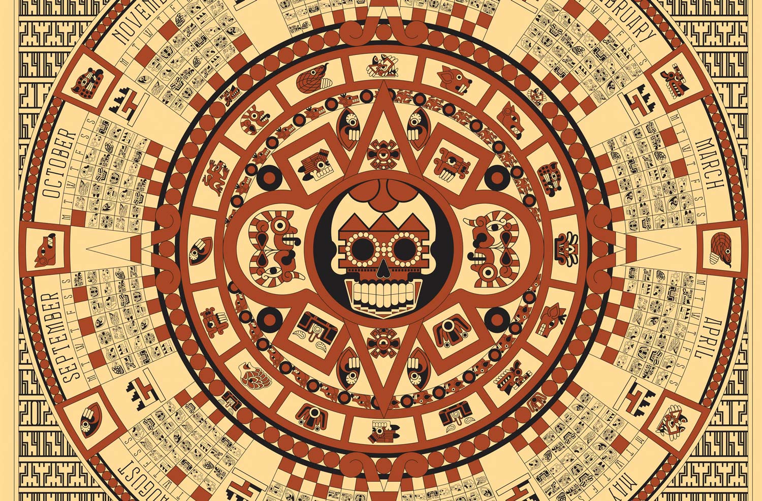
Corn Studio designed ‘The calendar after the end?’ based on the Aztecs Art and the history of the natives of Middle America, and on the false translation of the Mayans prophecy according to which by the end of 2012 the world would come to an end. The calendar is also based on the stone of the Aztec Sun god and has a question mark along with the title, to signify the designers’ ignorance for what may come.
For the title, Corn Studio used Tikal typeface. Tikal is a brand new, experimental typeface designed by Richard de Ruijter for ‘Ten Dollar Fonts’, inspired by ancient South American culture. Although Richard has never been to South America, his typeface is a personal interpretation of what he feels their modern type would have looked like in this day and age.
“According to Mayans, in 21-12-2012 the world will not end, it will be re-modified. Their calendar denotes that the 21st of December marks the end of time and the beginning of no-time. It is the end of the Macha and the beginning of Pacha. It is the end of selfishness and the beginning of brotherhood. It is the end of individualism and the beginning of collectivism. It is the end of hatred and the beginning of love. The end of lies and the beginning of truth. It is the end of sadness and the beginning of joy. It is the end of division and the beginning of unity.” – Evo Morales, President of Bolivia to the UN General Assembly, 67th session, 2012.
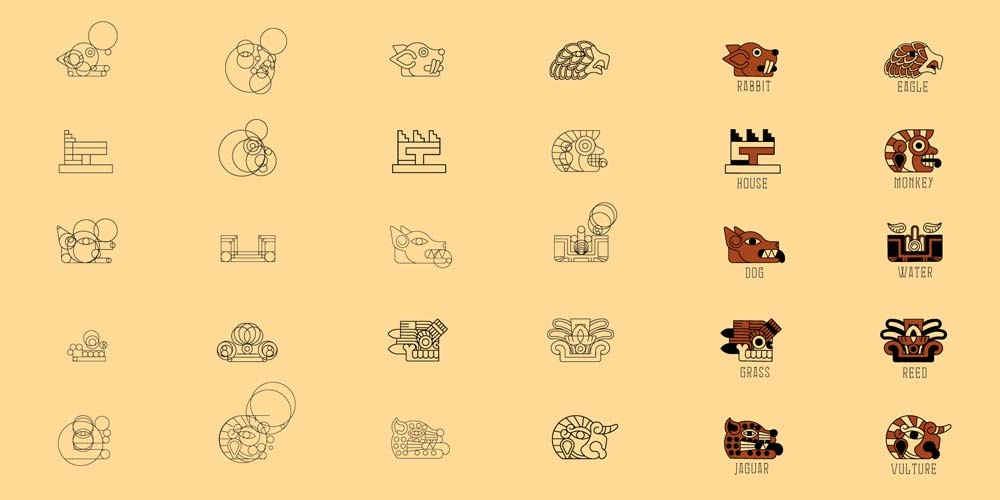
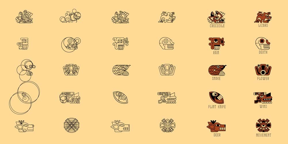
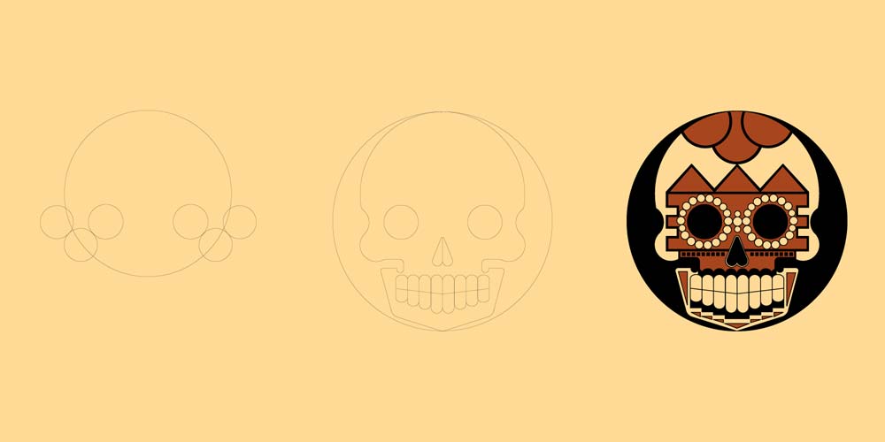
In many of the Aztecs’ calendars, each day had the name of an animal, a natural element or an activity, along with a motto. The designers replaced the numbers of the days with Aztecs glyphs, to express their belief that it is time for people to stop counting the time in numbers and start counting in actions. They also replaced the god of the Sun in the center with the god of Chaos (this is a fictional god!) because in a world that time doesn’t count in numbers… chaos prevails! Around the calendar the designers wrote a motto for each day in a way that can be used as an index. It’s a calendar made for someone who wants to see how he can enjoy his day rather than to see what day it actually is.
Corn Studio screen-printed the poster in a large format 70×100 cm, 3 colors on a variety of papers and materials. In doing so, they tried to emulate the real size of the stone of Sun god. They printed 3 colors, black, 3x metallic inks (gold, silver, bronze) and phosphorescent ink in variable combinations. The silkscreen printing technique was selected because it is the ancient printing method and it has the greatest persistence in time.