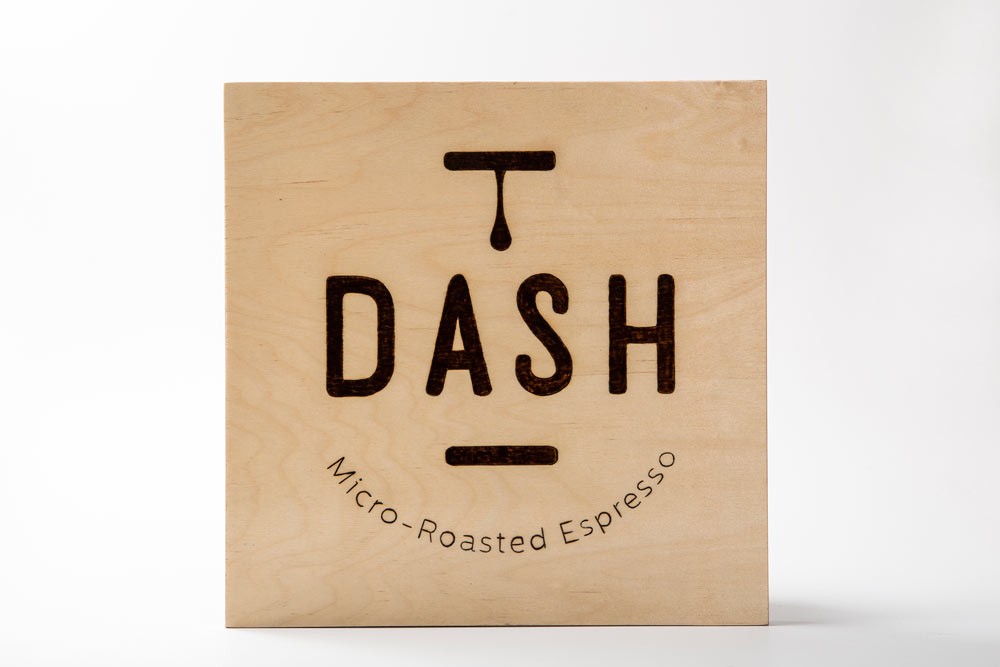
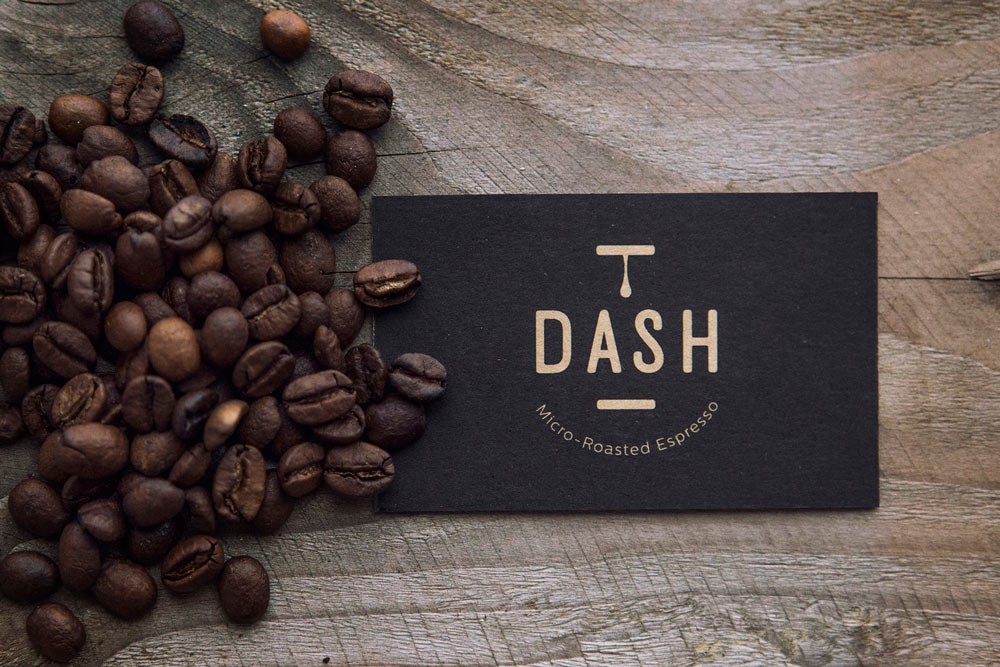
S & Team provided the name, logo and packaging for a new espresso blend of Dassyras, a family-owned coffee roaster that produces artisan Greek and filter coffee. As the second generation of the coffee brand entered the business, they began crafting a unique espresso blend of several different specialty coffee beans. Its distinctively rich taste and impressive aroma paved the way for the product to gradually become a bestseller in the wholesale market.
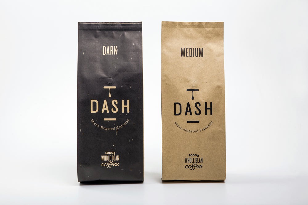
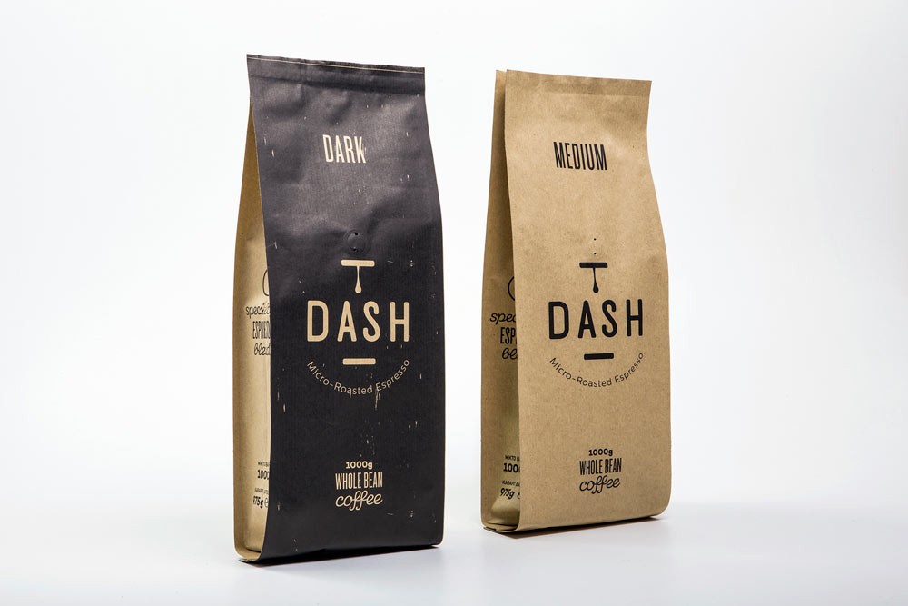
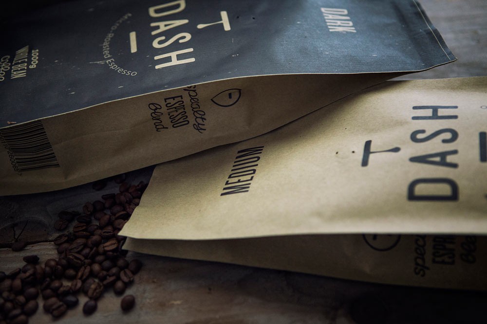
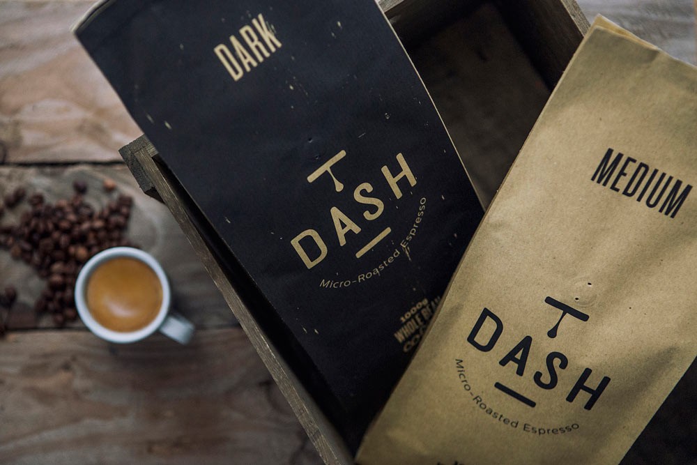
Τhe name ‘Dash’ was chosen as it is short, good-sounding, easy to remember and somehow connected to the family business name – it sounds a lot like “Dassyras”. With regards to the logo, ‘Dash’ was placed in between two dashes to indicate a pause/break, just like ‘em dashes’, which are used to indicate a break in sentence. A coffee drop stands still, creating the impression that it will fall any minute. To convey the brand’s authentic and micro-roasting personality, S & Team designed and printed the business cards on brown kraft paper. Following the same handmade logic, they made by hand, one by one, Dash’s wood labels with the logo wood-burned into them. The packaging includes only the absolutely necessary information; the logo, its copyline, weight, type of roasting and blend. Different colors on packaging (kraft and slightly faded black) indicate the type of coffee roasting in each packaging; kraft for medium-roasted and black for dark roasted respectively.