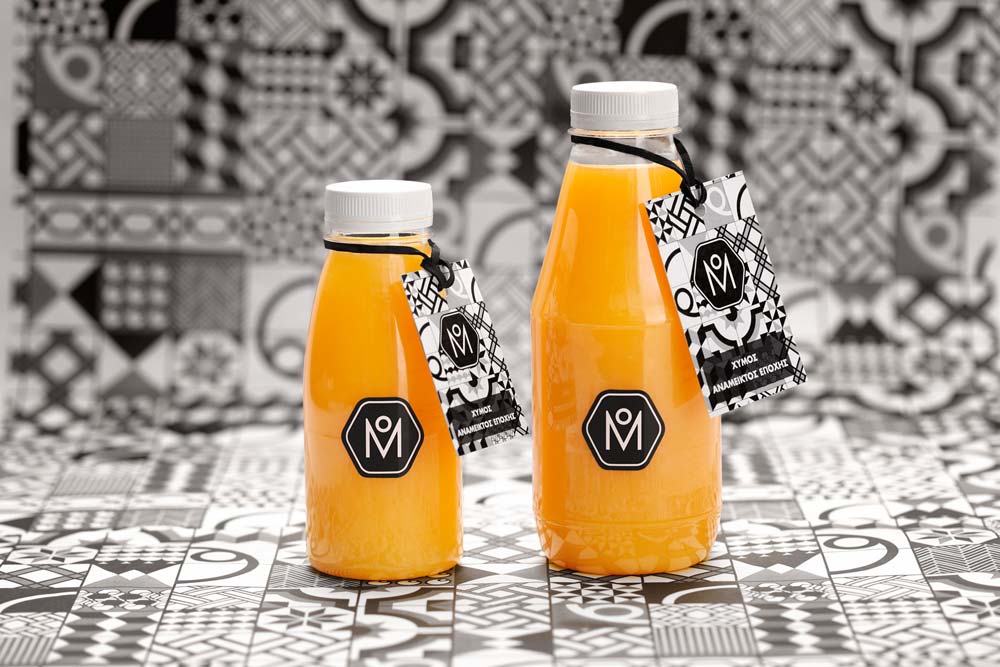
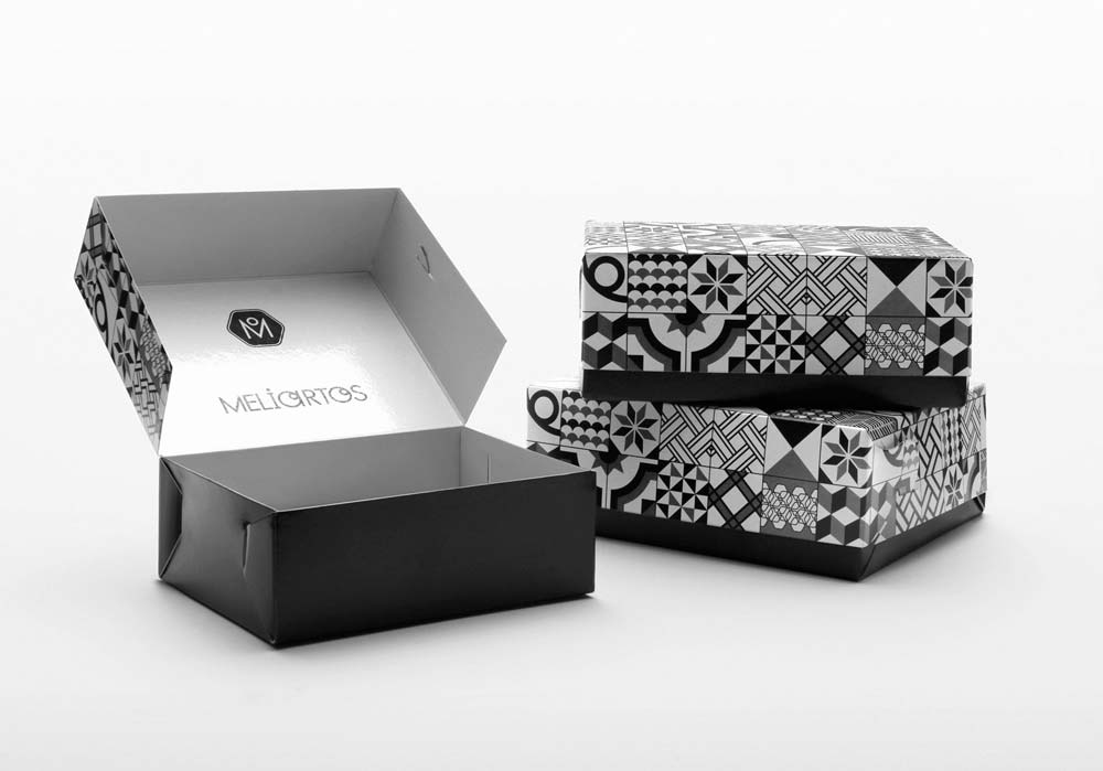
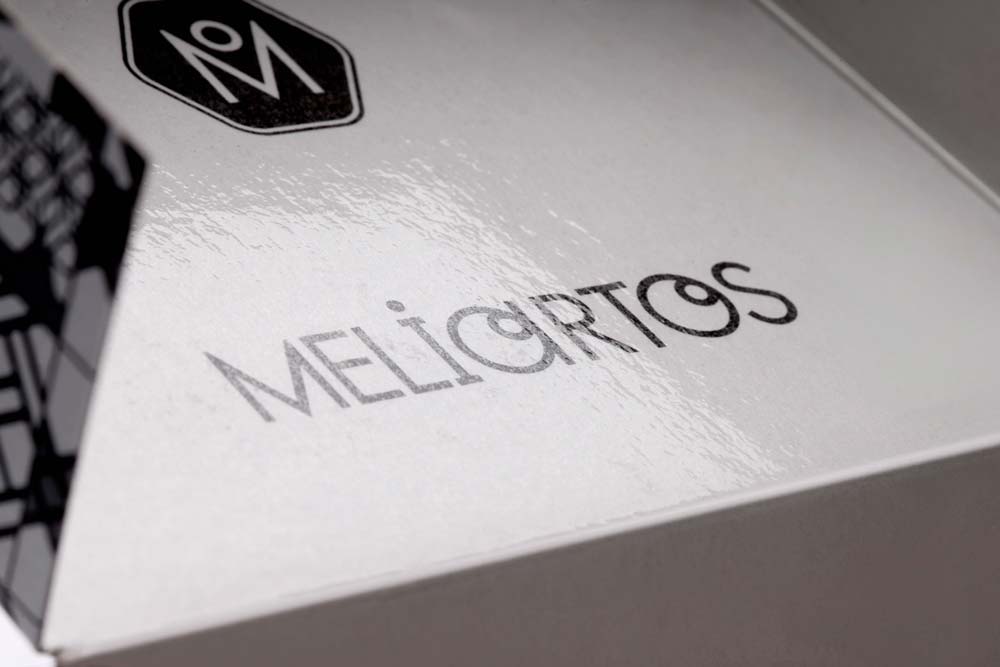
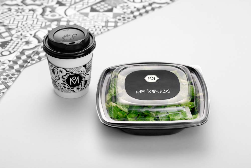
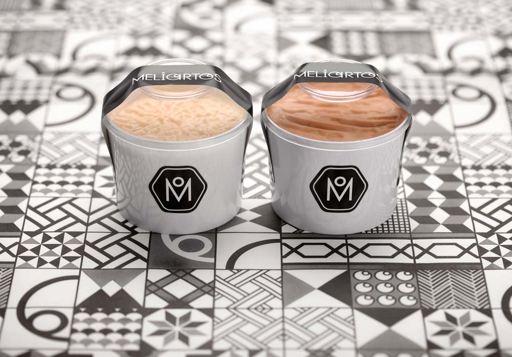
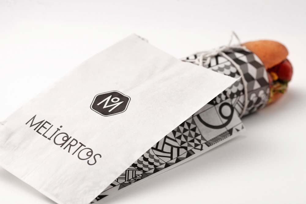
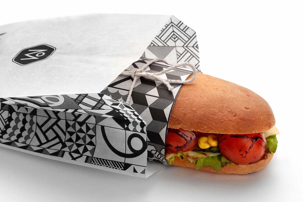
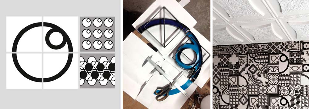
Kanella designed a strong and elegant identity and packaging for Meliartos, a contemporary Athenian bakery that pays homage to the candidly quaint style of old Athens by creating and serving fresh bites and drinks. The company’s logo and its various applications, inspired by the Byzantine bread stamps, take a rather typographic route. Each component of the name ‘Meliartos’ is illustrated in the logo. The hexagon resembles a hive for ‘meli,’ Greek word for honey, and the circle brings to mind ‘artos,’ Greek word for bread.
All applications unveil elegant details influenced by tile motifs in the neoclassical homes of old Athens. The decorative pattern system is visually strong and allows flexible design choices. It is, therefore, not always necessary to read the logo in order to recognize the brand. The vibrant colors of Meliartos attract the attention thanks to the absence of background color. In the black and white packaging series, there is a small detail worth mentioning: going against what’s usually expected, the logo on the paper box can be seen after opening it up and while the customer enjoys its contents. The brand identity has also ‘invaded’ the store’s walls and floors, and details from the logo make an eye-catching statement as they appear on certain tiles.