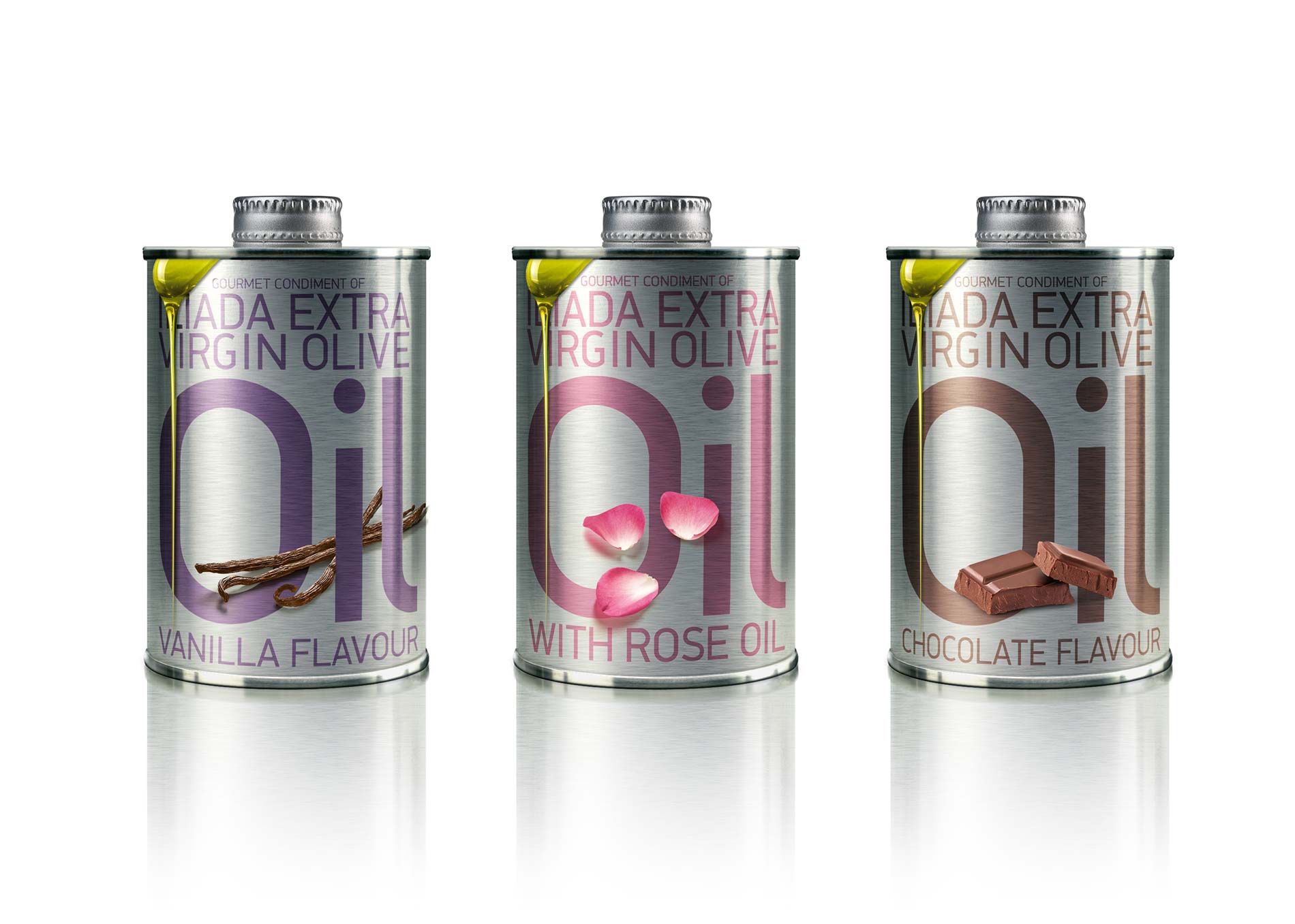
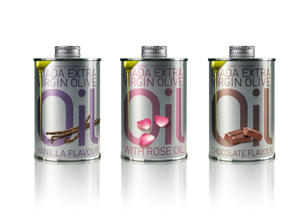
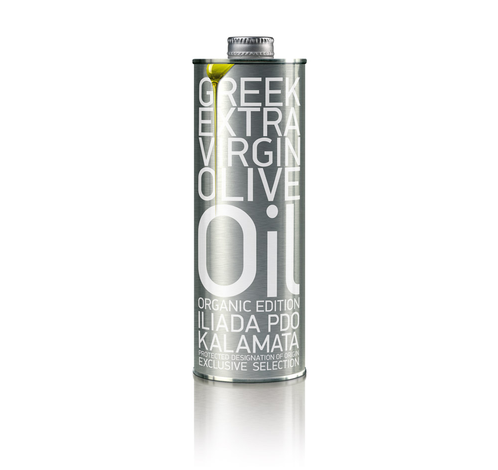
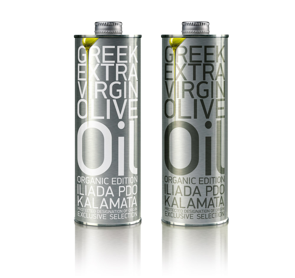
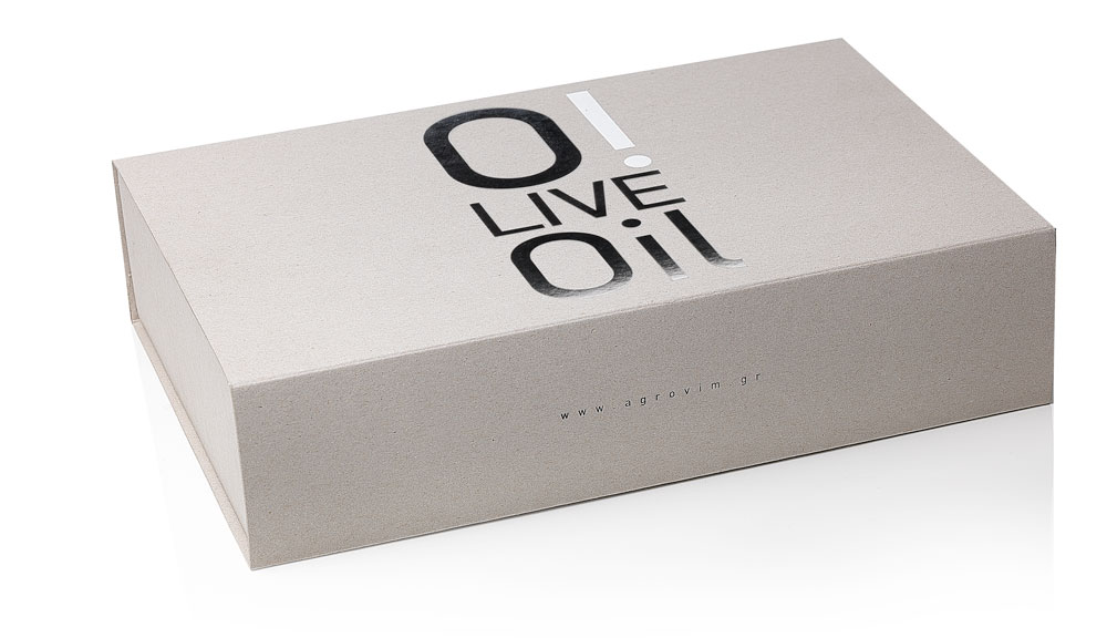
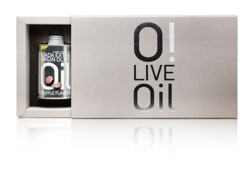
The concept behind this design was to create a visual differentiation for a premium quality olive oil, by deliberately – and in every way possible – moving away from traditional vessels and symbols of olive oil quality or clichés of provenance. The pack design targets the cultivated mind of an international food connoisseur who has the spirit of an aesthete: on a metallic can which implies function and culinary power, a realistic-looking drop of oil, comes almost as an afterthought, in order to keep the product safely grounded to the food section of every selling point. If there ever was a slogan attached to it, it would read ‘simply oil’.
Agrovim premium olive oil by mousegraphics